Where to find TradingView Volume Footprint?
We can find the Volume Footprint by opening up chart types on TradingView on top panel. Click the candle icon and select "Volume Footprint".
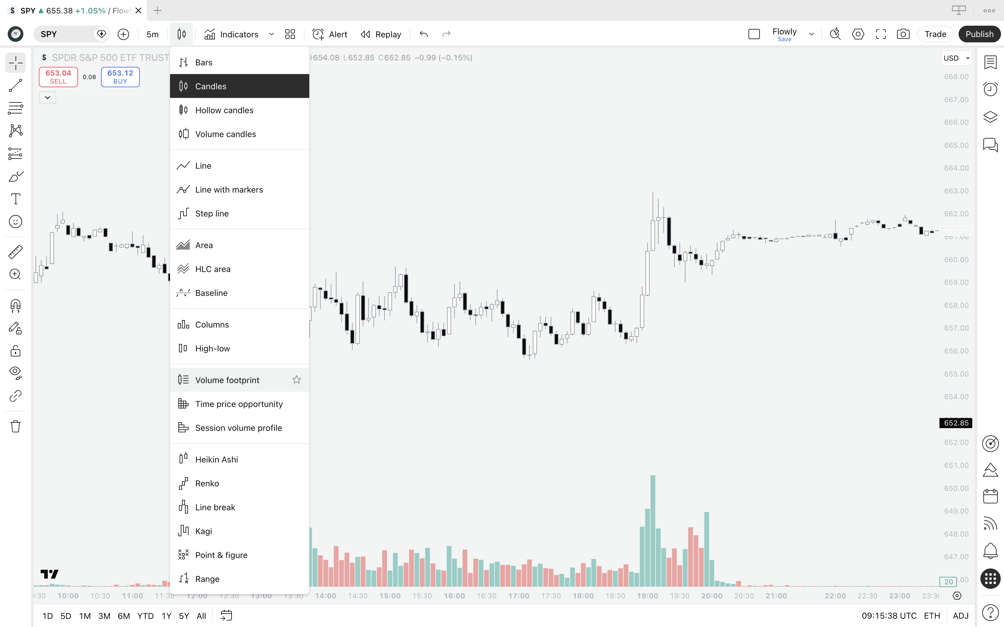
If the Volume Footprint did not open, it means you got hit by a paywall. Yes, TradingView requires paid plan to access the tool.
A bit disappointing, but it is a premium grade tool so let's cut some slack. We'll cover later if it's worth the money.
What's a Volume Footprint?
Volume Footprint is an advanced orderflow tool breaking down candles into sections that show amount of buying and selling occurring at each point in price. This type of analysis is often referred to as volume at price or simply orderflow.
Whereas traditional charts show just price movement, Volume Footprint shows how price went there - where bulls and bears battled and where key interest is located.
Think of it like an X-ray view, revealing what happened under the hood in markets. Sounds powerful? That's because it is, or can be if you know how to use it.
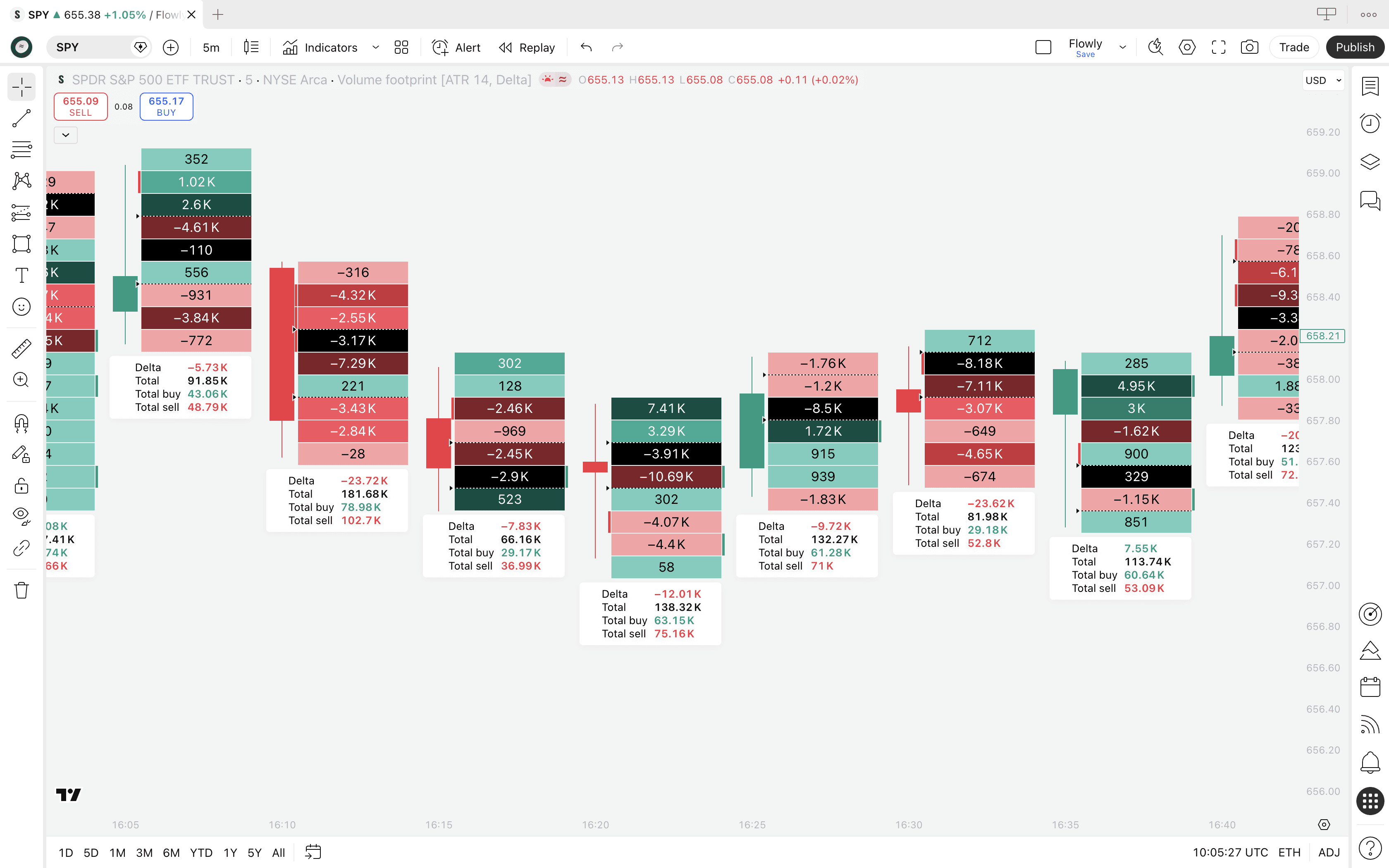
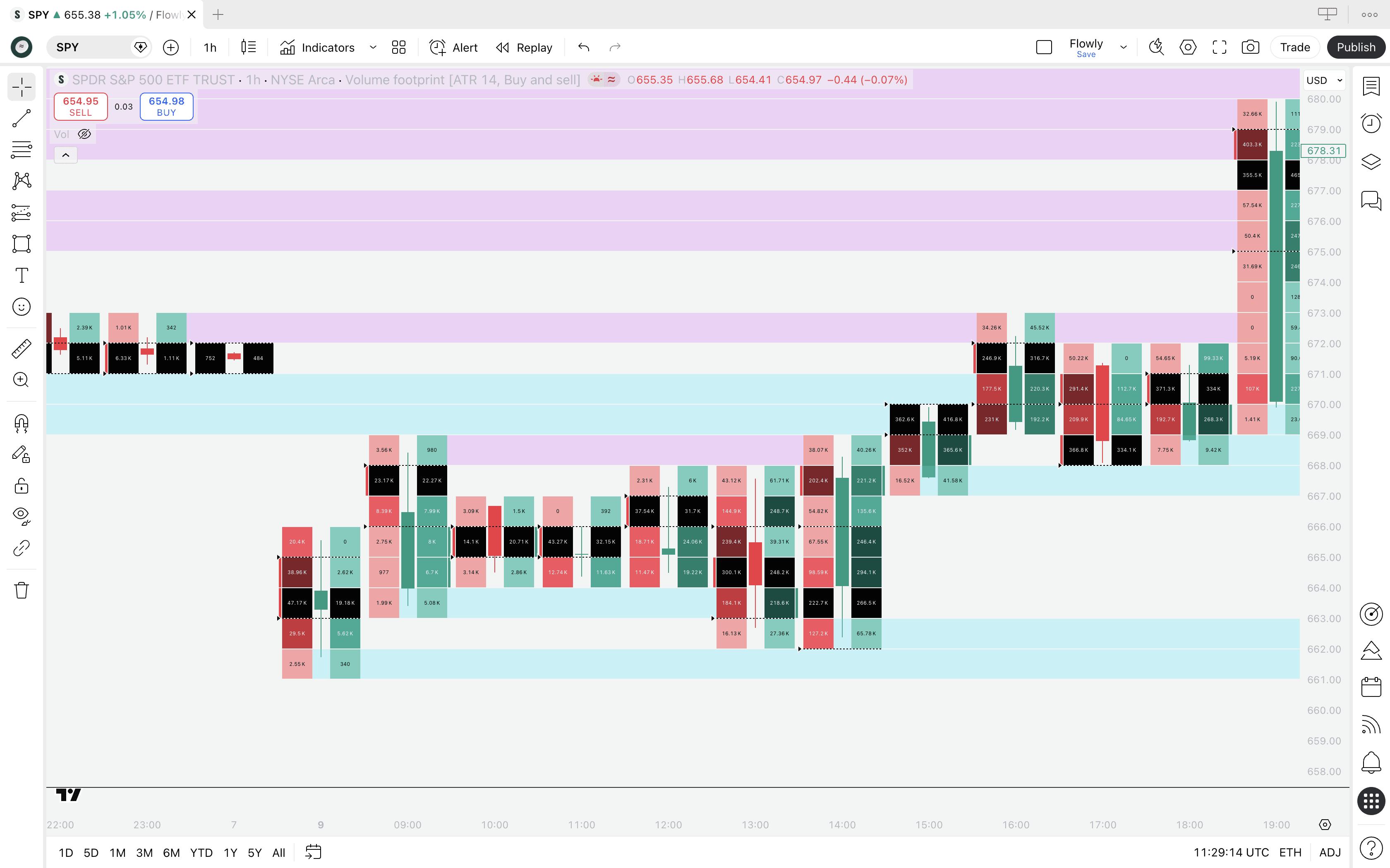
Here's what volume footprint looks like on TradingView.
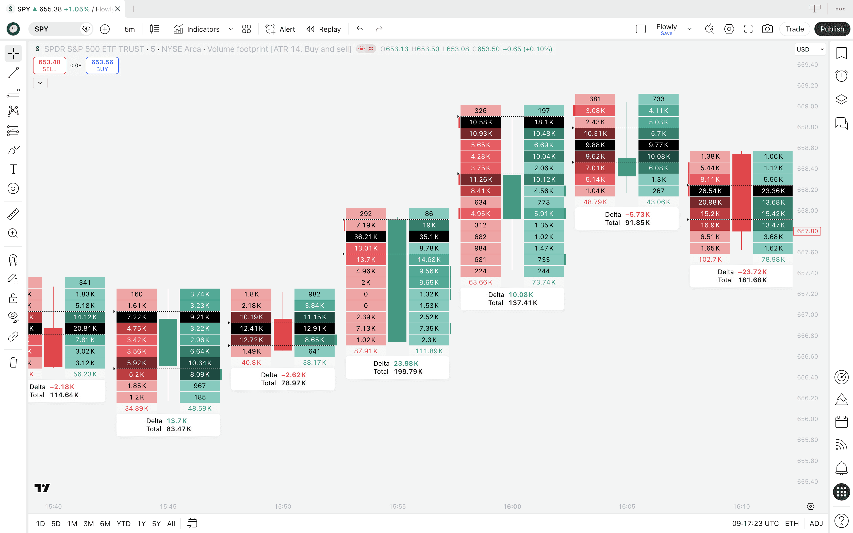
On the left side, we can see amount of sell volume that occurred at that price area. On the right side, we see that for buy volume.
Reading the footprint
The brighter colors intuitively tell us where selling and buying was highest - brighter colors correspond to larger trading volume. We can also see the exact amount of stocks traded at the price level by looking at the value label.
Example
Value of 292 on sell-side (red) indicate 292 of stock was sold at the price level
Value of 13.1K on buy-side (green) indicate 13.1K of stock was bought at the price level
There's also a few extras that aren't apparent on first glimpse - the black section, arrows on the left side and label with data below.
They're actually in some ways more important than the buy and sell volume we see on the sides.
Point of Control (POC)
This is what the black section in the footprint points to. Point of Control (POC for short) refers to price level with highest amount of volume traded.
It's important to note POC is not calculated using buy volume or sell volume, but the total sum of the two. So where buy + sell volume was highest, there's the POC.
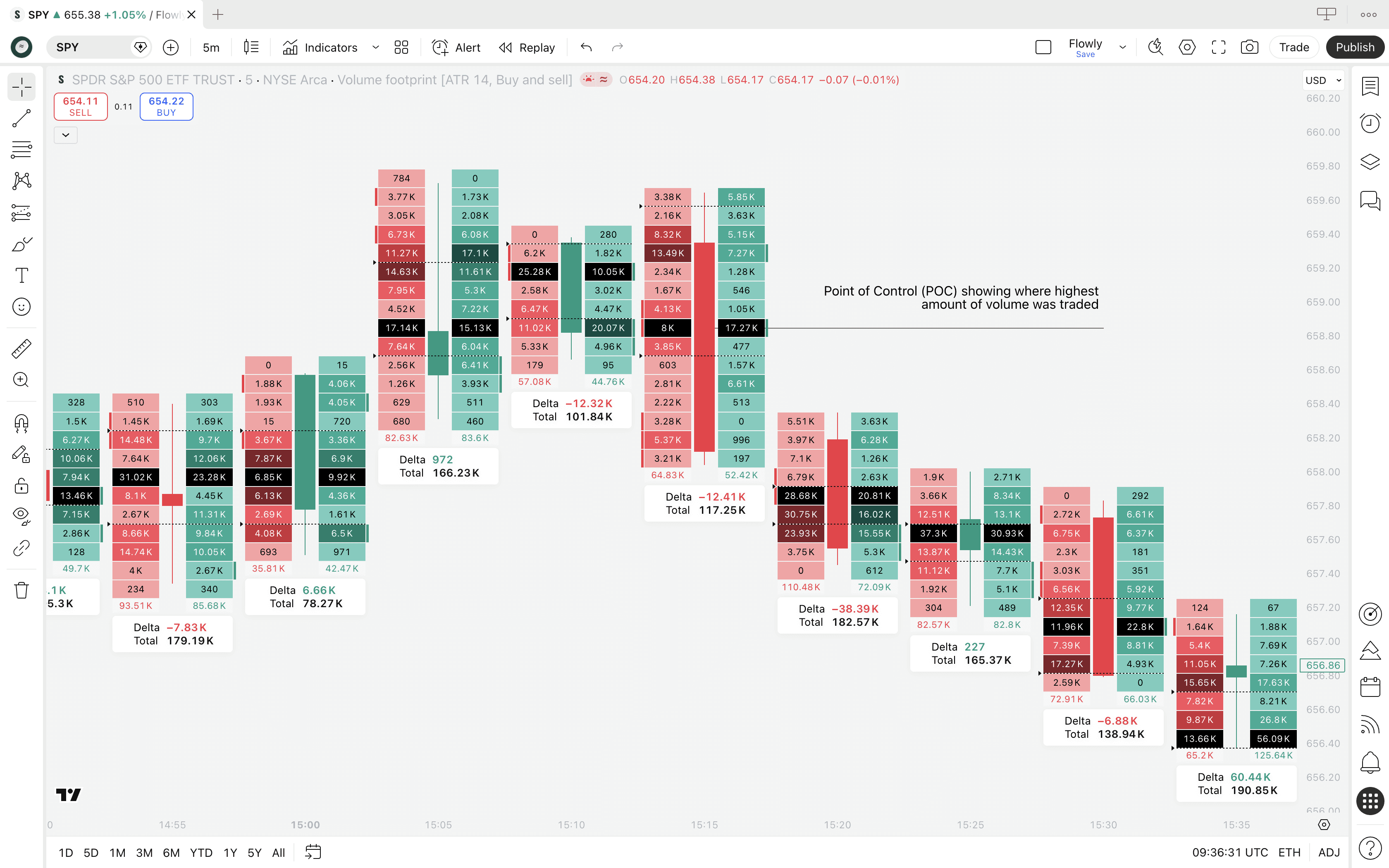
This is arguably the most crucial and important information on a footprint as it tells us where traders are showing most interest.
How to read Point of Control
The way to read that ultimately depends on candle shape and market regime, but in simple terms this is how to read the POC.
Point of Control location | Interpretation |
|---|---|
Upper end of candle | Traders were most willing to trade higher prices (buy skew) |
Middle end of candle | Traders were undecided on direction (equilibrium) |
Lower end of candle | Traders were most willing to trade lower prices (sell skew) |
Value Area (VA)
This is what the two arrows on the left side tell us, although they are pretty small so you might have to squint your eyes a little to see them.
Value Area represents a range in a candle where 70% of all volume was traded. This area is calculated using POC as the starting point.
When POC is identified, value area is calculated by progressively summing all volume traded above and below it, until 70% of all trading volume of the candle is captured within the range.
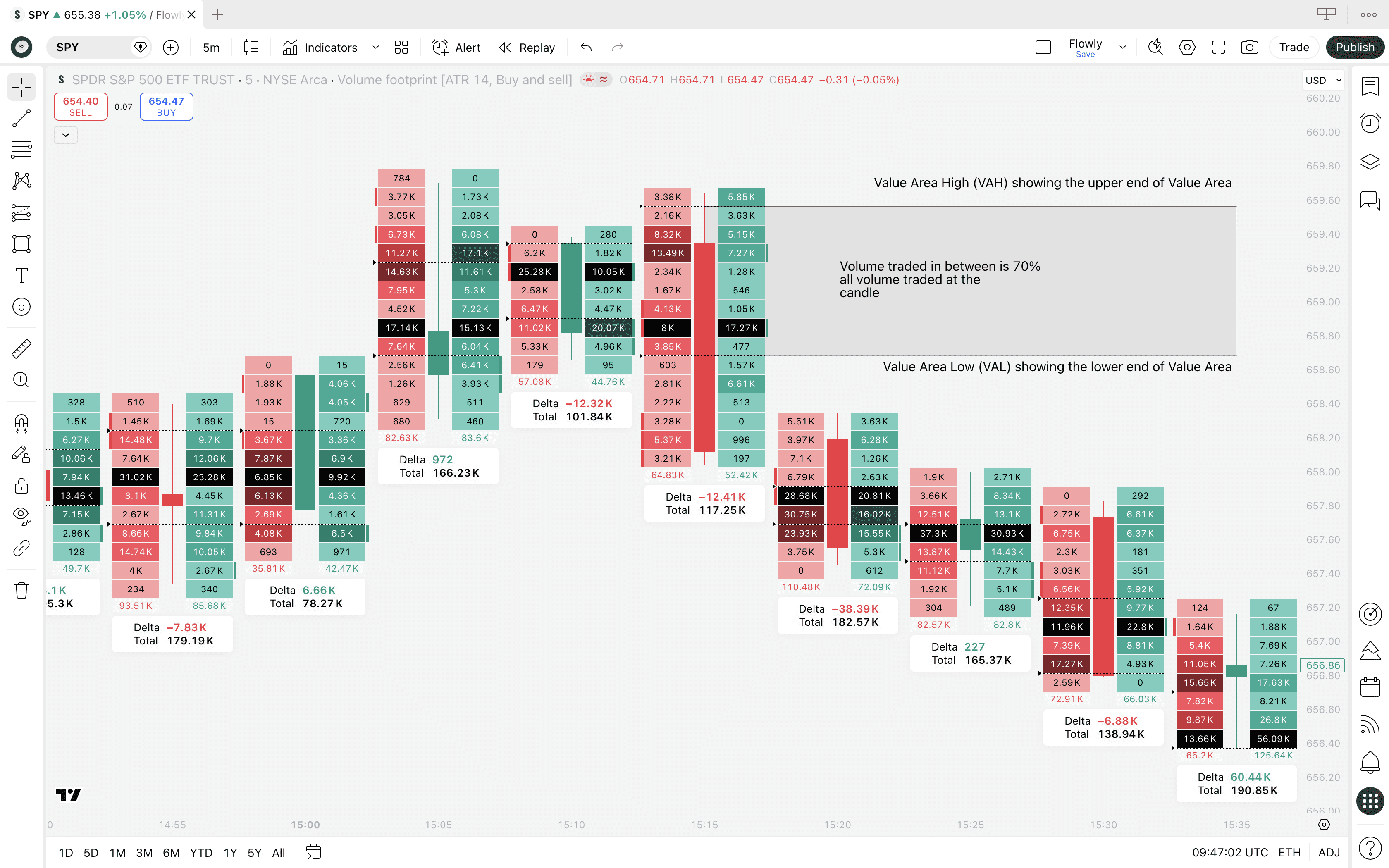
That's the area of value, hence the name Value Area. The upper end of this range is called Value Area High (VAH) and the lower end respectively Value Area Low (VAL).
How to read Value Area
Value Area can be read similarly to Point of Control, but instead of reading the pinnacle of interest, we're reading the "mass interest" that speaks of general broad participation.
Value Area location | Interpretation |
|---|---|
Upper end of candle | Traders were generally interested in higher prices (broad buy skew) |
Middle end of candle | Traders were undecided on direction (broad equilibrium) |
Lower end of candle | Traders were generally interested in lower prices (broad sell skew) |
Info label
This is the white box with "Delta" and "Total" values below each footprint. The point of this label is to aggregate all the separate footprint values together.
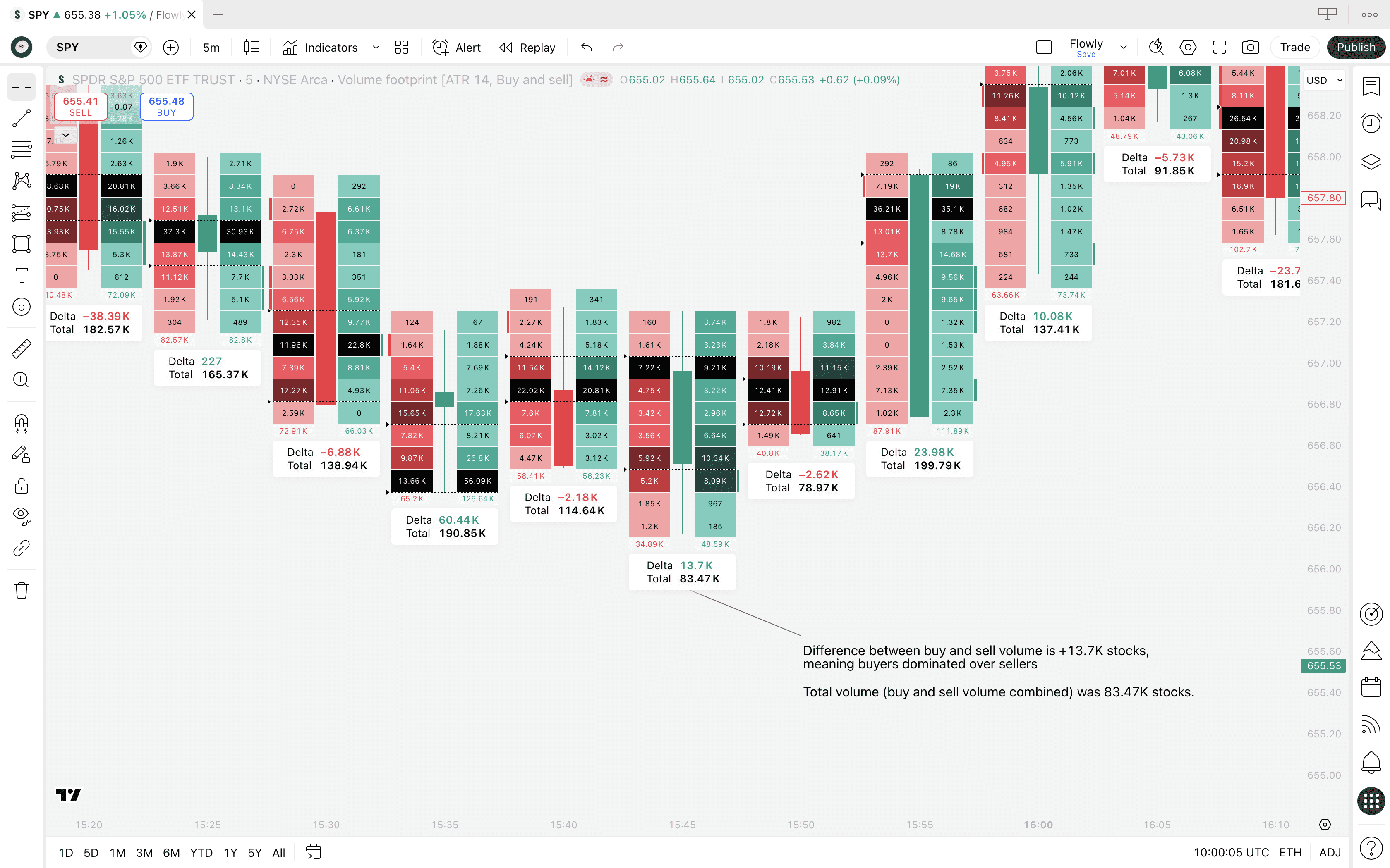
Delta tells us difference between all buy and sell volume traded at the footprint, calculated simply: buy volume - sell volume.
If negative, there was more sell volume than buy volume. If positive, there was more buy volume.
Example
If Delta is -2.1K, there is 2.1K more stocks sold than bought in the whole candle. Positive values indicate the opposite - more stocks bought than sold.
Total tells us total sum of all buy and sell volume traded at the footprint, calculated equally simply: buy volume + sell volume.
This value will always be positive, it's simply all volume summed together.
Where to find TradingView Volume Footprint?
We can find the Volume Footprint by opening up chart types on TradingView on top panel. Click the candle icon and select "Volume Footprint".
If the Volume Footprint did not open, it means you got hit by a paywall. Yes, TradingView requires paid plan to access the tool.
A bit disappointing, but it is a premium grade tool so let's cut some slack. We'll cover later if it's worth the money.
What's a Volume Footprint?
Volume Footprint is an advanced orderflow tool breaking down candles into sections that show amount of buying and selling occurring at each point in price. This type of analysis is often referred to as volume at price or simply orderflow.
Whereas traditional charts show just price movement, Volume Footprint shows how price went there - where bulls and bears battled and where key interest is located.
Think of it like an X-ray view, revealing what happened under the hood in markets. Sounds powerful? That's because it is, or can be if you know how to use it.
Here's what volume footprint looks like on TradingView.
On the left side, we can see amount of sell volume that occurred at that price area. On the right side, we see that for buy volume.
Reading the footprint
The brighter colors intuitively tell us where selling and buying was highest - brighter colors correspond to larger trading volume. We can also see the exact amount of stocks traded at the price level by looking at the value label.
Example
Value of 292 on sell-side (red) indicate 292 of stock was sold at the price level
Value of 13.1K on buy-side (green) indicate 13.1K of stock was bought at the price level
There's also a few extras that aren't apparent on first glimpse - the black section, arrows on the left side and label with data below.
They're actually in some ways more important than the buy and sell volume we see on the sides.
Point of Control (POC)
This is what the black section in the footprint points to. Point of Control (POC for short) refers to price level with highest amount of volume traded.
It's important to note POC is not calculated using buy volume or sell volume, but the total sum of the two. So where buy + sell volume was highest, there's the POC.
This is arguably the most crucial and important information on a footprint as it tells us where traders are showing most interest.
How to read Point of Control
The way to read that ultimately depends on candle shape and market regime, but in simple terms this is how to read the POC.
Point of Control location | Interpretation |
|---|---|
Upper end of candle | Traders were most willing to trade higher prices (buy skew) |
Middle end of candle | Traders were undecided on direction (equilibrium) |
Lower end of candle | Traders were most willing to trade lower prices (sell skew) |
Value Area (VA)
This is what the two arrows on the left side tell us, although they are pretty small so you might have to squint your eyes a little to see them.
Value Area represents a range in a candle where 70% of all volume was traded. This area is calculated using POC as the starting point.
When POC is identified, value area is calculated by progressively summing all volume traded above and below it, until 70% of all trading volume of the candle is captured within the range.
That's the area of value, hence the name Value Area. The upper end of this range is called Value Area High (VAH) and the lower end respectively Value Area Low (VAL).
How to read Value Area
Value Area can be read similarly to Point of Control, but instead of reading the pinnacle of interest, we're reading the "mass interest" that speaks of general broad participation.
Value Area location | Interpretation |
|---|---|
Upper end of candle | Traders were generally interested in higher prices (broad buy skew) |
Middle end of candle | Traders were undecided on direction (broad equilibrium) |
Lower end of candle | Traders were generally interested in lower prices (broad sell skew) |
Info label
This is the white box with "Delta" and "Total" values below each footprint. The point of this label is to aggregate all the separate footprint values together.
Delta tells us difference between all buy and sell volume traded at the footprint, calculated simply: buy volume - sell volume.
If negative, there was more sell volume than buy volume. If positive, there was more buy volume.
Example
If Delta is -2.1K, there is 2.1K more stocks sold than bought in the whole candle. Positive values indicate the opposite - more stocks bought than sold.
Total tells us total sum of all buy and sell volume traded at the footprint, calculated equally simply: buy volume + sell volume.
This value will always be positive, it's simply all volume summed together.
Volume Footprint templates
TradingView's Volume Footprint has many "views" called templates. Templates visualize the volume at price data in different ways, used either for pure preference or functionally different use cases.
The default template is called "Buy and sell". Unsurprisingly, this template shows buy and sell volume at price side by side. But there's also three others we can play around with.
Ladder Footprint template
Ladder template is essentially the same as "Buy and sell" template, but the colors work a bit different, highlighting only the side that was higher.
For example, if 2K of stock was sold and only 200 stocks were bought, you'll only see the red sell box. Otherwise the sections are plain.
This template is essentially good for getting focus on where the mismatch is happening without getting lost in the color jungle of green and red.
If we see just red, sellers dominated by a big margin. If just green, buyers had the upper hand.
Delta Footprint template
Delta template is again somewhat similar, but showing only one column representing net volume delta.
Volume delta simply means difference between buyers and sellers and this template shows just the final difference.
If buy volume is higher than sell volume, volume delta is net buyers. Vice versa is true for higher sell volume. Plus and minus. Green and red.
The value displayed tells us how much the leftover is when comparing buy and sell volume.
Example
Net volume delta of +3.29K shows 3.29K more stocks bought than sold at the price level.
Net volume delta of -1.3K shows 1.3K more stocks sold than bought at the price level.
We also get more expanded data on the info label, showing buy and sell volume on separate lines on top of the usual total volume and total delta.
Total Footprint template
This template is distinctly different, showing the sum of all buy and sell volume. It does not compare, it aggregates.
This template shows sections in lighter and darker shades of blue, corresponding to amount of net volume.
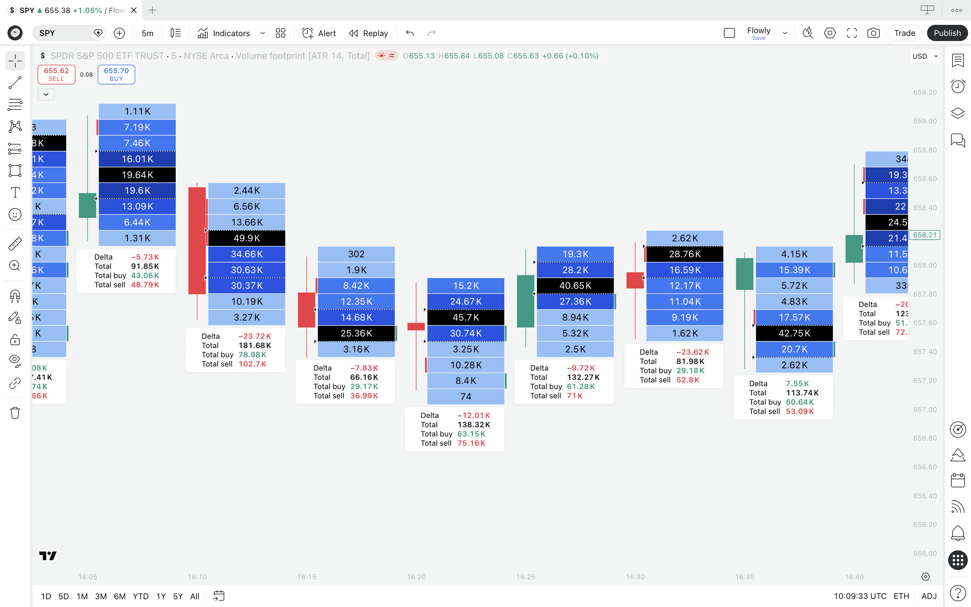
Same color rules apply. Lighter = less volume, darker = more volume. We can also see the amount of net volume traded at each price level from the values.
This template is more suitable for gauging general interest of traders, where the total trading activity is flowing.
Cluster and Profile displays
By default Volume Footprint for all templates is shown as cluster. Simple column broken down into sections.
We can also view each template in "Profile" display, highlighting difference using bars that vary in size, exactly like in a volume profile.
Here's Buy and sell, Delta and Total templates using "Profile" display.
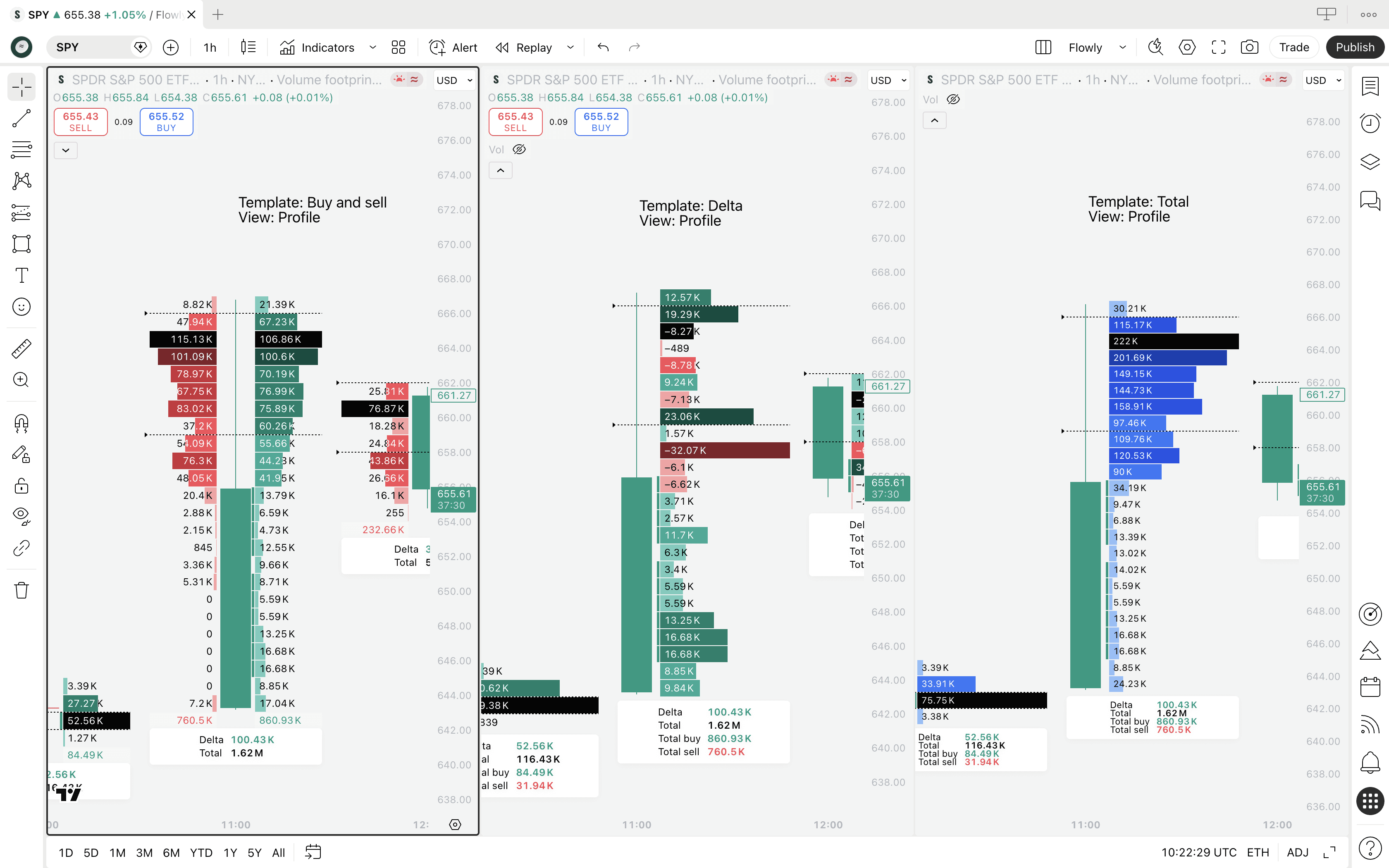
Volume Footprint templates
TradingView's Volume Footprint has many "views" called templates. Templates visualize the volume at price data in different ways, used either for pure preference or functionally different use cases.
The default template is called "Buy and sell". Unsurprisingly, this template shows buy and sell volume at price side by side. But there's also three others we can play around with.
Ladder Footprint template
Ladder template is essentially the same as "Buy and sell" template, but the colors work a bit different, highlighting only the side that was higher.
For example, if 2K of stock was sold and only 200 stocks were bought, you'll only see the red sell box. Otherwise the sections are plain.
This template is essentially good for getting focus on where the mismatch is happening without getting lost in the color jungle of green and red.
If we see just red, sellers dominated by a big margin. If just green, buyers had the upper hand.
Delta Footprint template
Delta template is again somewhat similar, but showing only one column representing net volume delta.
Volume delta simply means difference between buyers and sellers and this template shows just the final difference.
If buy volume is higher than sell volume, volume delta is net buyers. Vice versa is true for higher sell volume. Plus and minus. Green and red.
The value displayed tells us how much the leftover is when comparing buy and sell volume.
Example
Net volume delta of +3.29K shows 3.29K more stocks bought than sold at the price level.
Net volume delta of -1.3K shows 1.3K more stocks sold than bought at the price level.
We also get more expanded data on the info label, showing buy and sell volume on separate lines on top of the usual total volume and total delta.
Total Footprint template
This template is distinctly different, showing the sum of all buy and sell volume. It does not compare, it aggregates.
This template shows sections in lighter and darker shades of blue, corresponding to amount of net volume.
Same color rules apply. Lighter = less volume, darker = more volume. We can also see the amount of net volume traded at each price level from the values.
This template is more suitable for gauging general interest of traders, where the total trading activity is flowing.
Cluster and Profile displays
By default Volume Footprint for all templates is shown as cluster. Simple column broken down into sections.
We can also view each template in "Profile" display, highlighting difference using bars that vary in size, exactly like in a volume profile.
Here's Buy and sell, Delta and Total templates using "Profile" display.
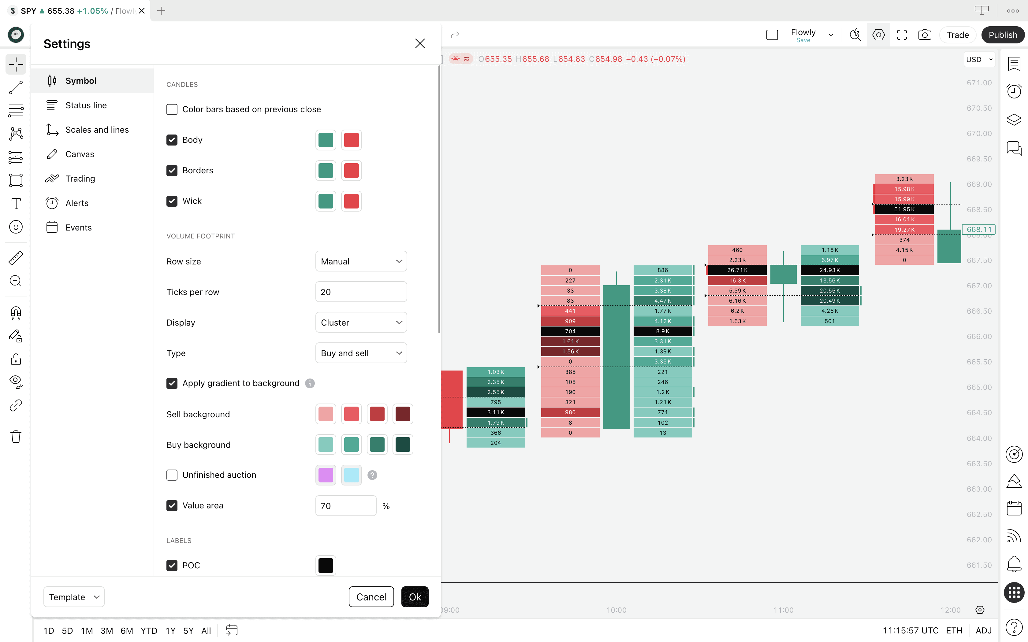
Volume Footprint settings
TradingView's Volume Footprint offers mainly visual settings, but there are a few that alter the way the footprint actually works. Here's what the settings menu looks like.
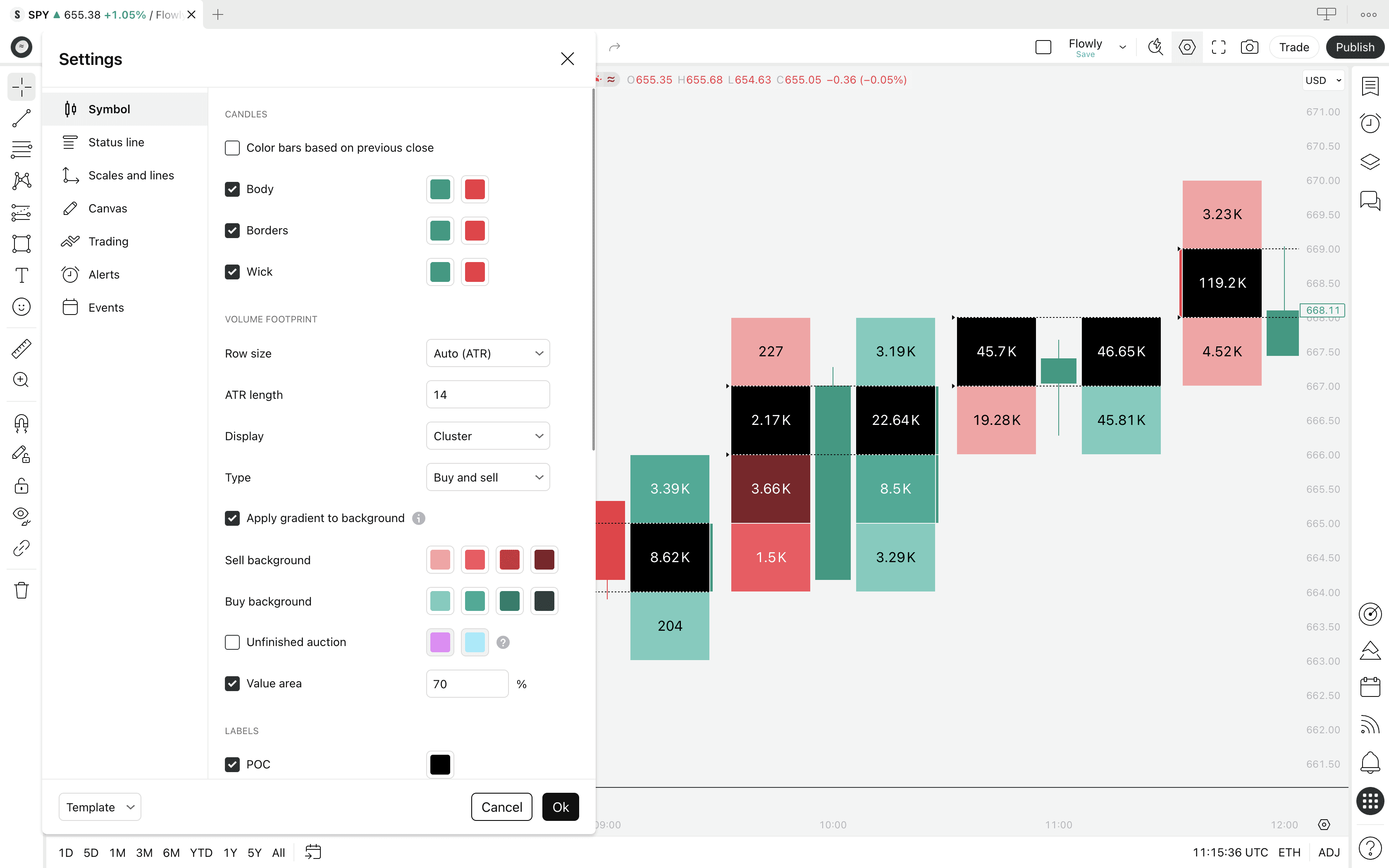
Row size
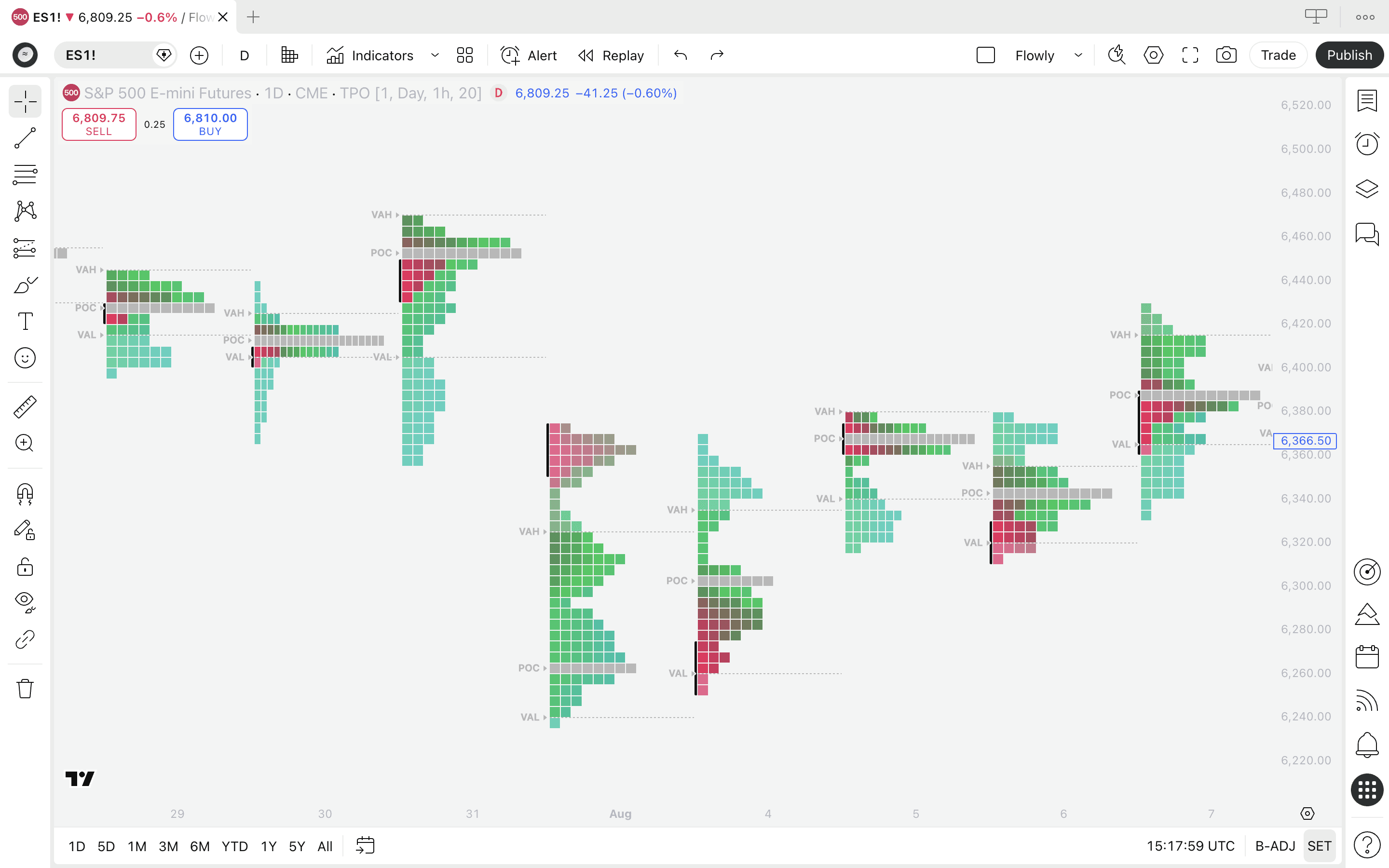
Row size controls how large the volume footprint sections are, available in two modes: ATR and Manual.
ATR calculates the section sizes automatically based on "whatever is typical movement for this chart". By increasing the ATR value, we get more smaller sections.
Manual calculates the section sizes based on price tick moves. Ticks refer to the minimum amount an asset can move, such as 1 cent.
If we define the tick size as 100, each section becomes 100 cents or $1. The smaller the defined tick value, the smaller the sections, as seen in the image.
Display
Display lets us pick either Cluster or Profile as the visualization method for the footprint. Cluster visualizes using a column, profile visualizes with varying sized volume bars.
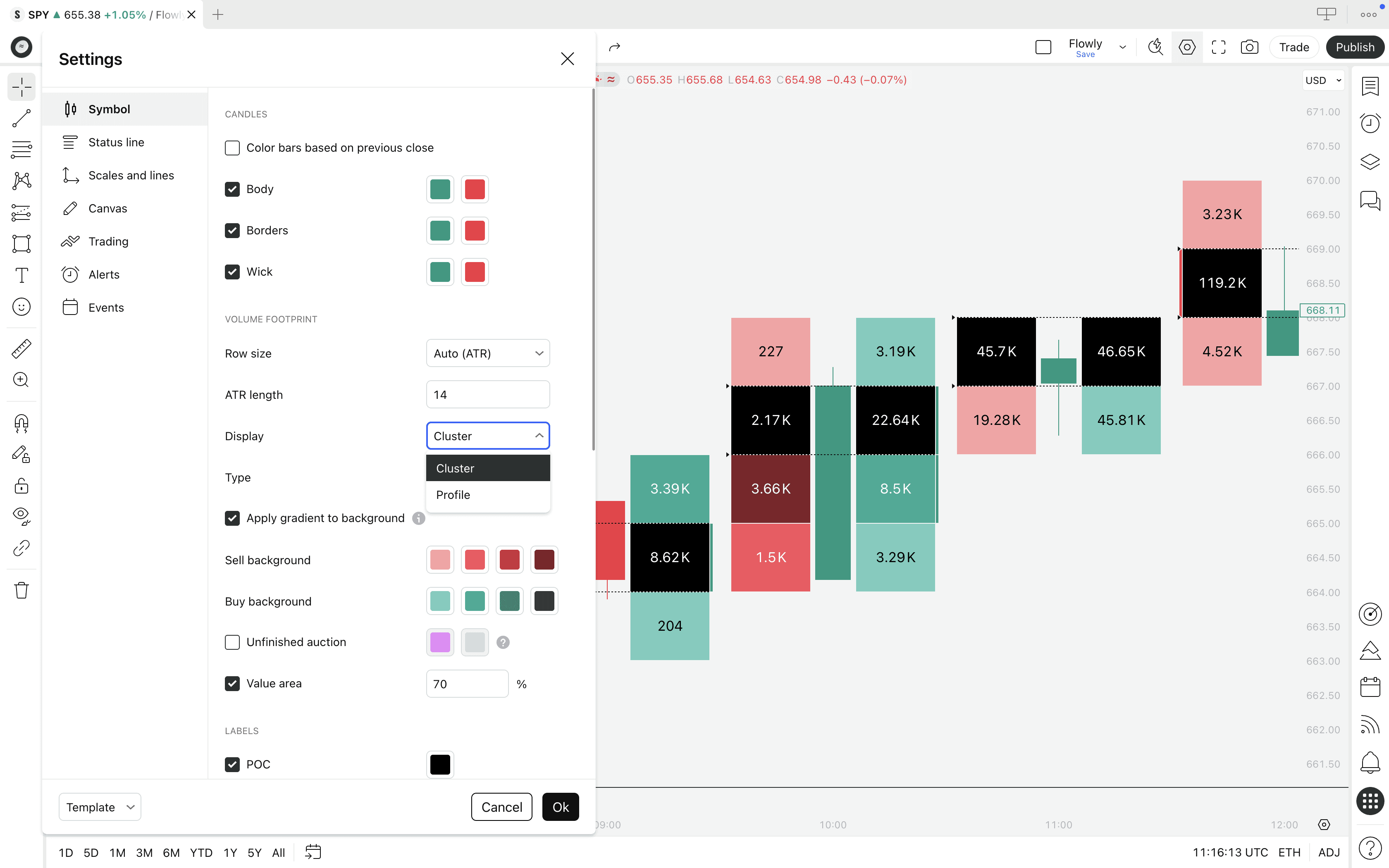
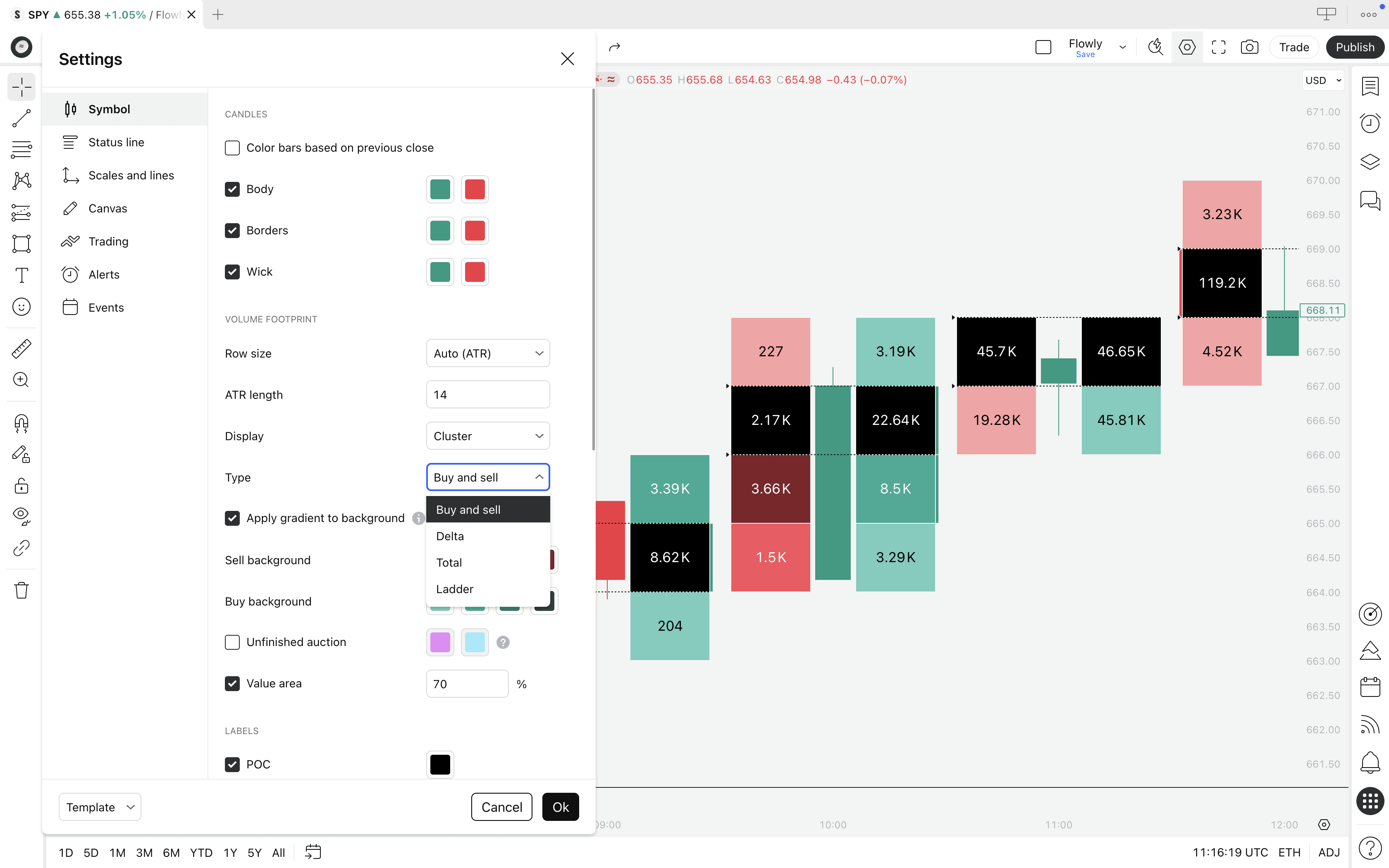
Templates
Template determines how the footprint is visualized and what it calculates exactly. Available options are Buy and sell, Ladder, Delta and Total.
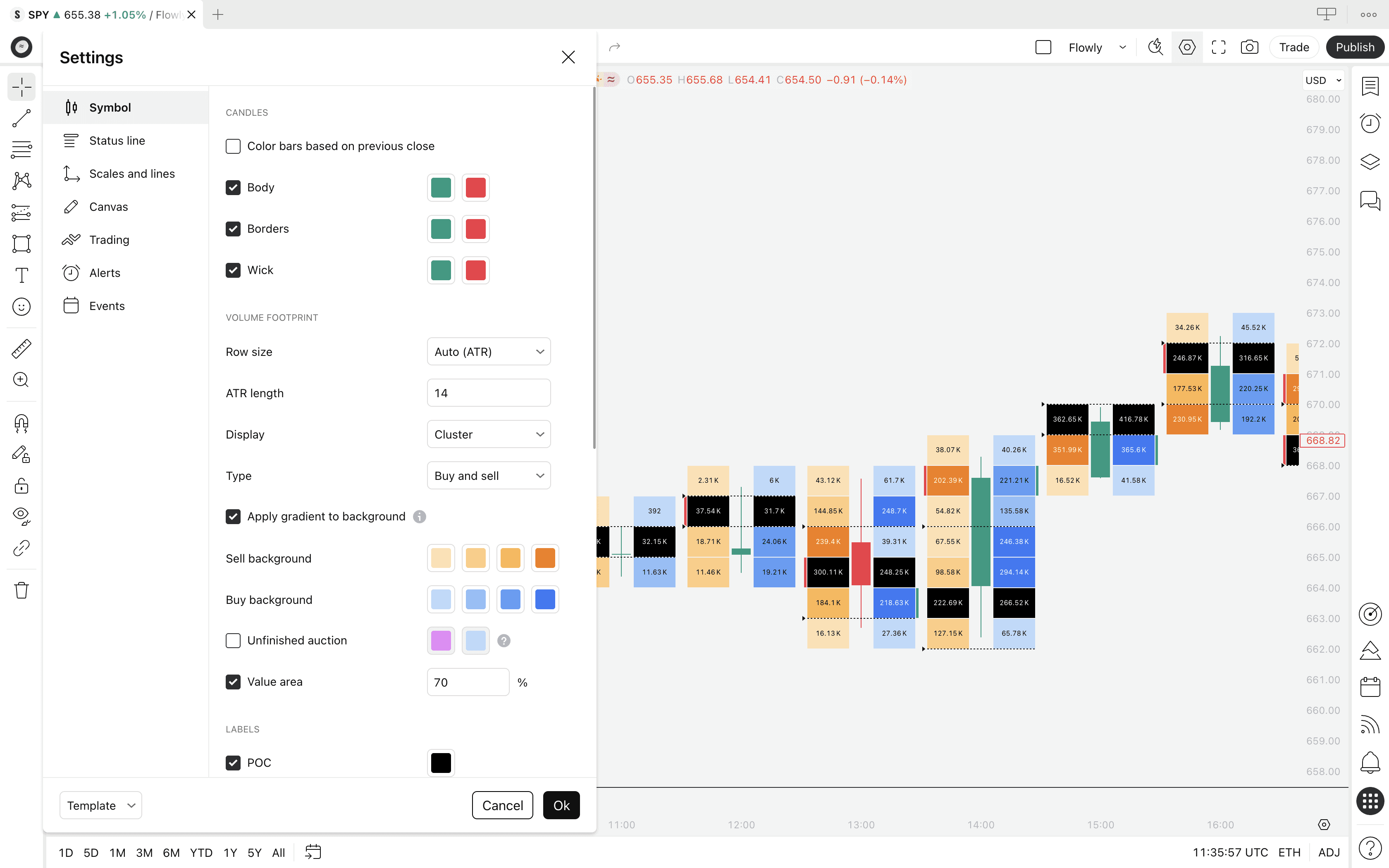
Visual settings
Visual settings such as gradient option and buy and sell volume colors let us customize the profile to our preference. We can also hide various elements, such as the POC and Value Area.
Value Area size
Value Area size controls the amount of volume to qualify as Value Area. By default Value Area is considered to be the area that captures 70% of all trading volume.
Unfinished auction
This setting extends lines across the chart representing where auction was "unfinished". Unfinished auction refers to highs or lows of a candle that trade high volume, indicating auction might still continue later.
These levels are considered to be prone to trading out later, continuing the auction.
Footprint alerts
TradingView Volume Footprint supports a few alerts for certain events in the footprint: buy imbalance, sell imbalance, stacked buy imbalance and stacked sell imbalance.
Imbalances refer to scenarios where volume on one side overwhelms the other side. Stacked imbalance refers to that too, but when occurring on multiple consecutive price levels.
Volume Footprint settings
TradingView's Volume Footprint offers mainly visual settings, but there are a few that alter the way the footprint actually works. Here's what the settings menu looks like.
Row size
Row size controls how large the volume footprint sections are, available in two modes: ATR and Manual.
ATR calculates the section sizes automatically based on "whatever is typical movement for this chart". By increasing the ATR value, we get more smaller sections.
Manual calculates the section sizes based on price tick moves. Ticks refer to the minimum amount an asset can move, such as 1 cent.
If we define the tick size as 100, each section becomes 100 cents or $1. The smaller the defined tick value, the smaller the sections, as seen in the image.
Display
Display lets us pick either Cluster or Profile as the visualization method for the footprint. Cluster visualizes using a column, profile visualizes with varying sized volume bars.
Templates
Template determines how the footprint is visualized and what it calculates exactly. Available options are Buy and sell, Ladder, Delta and Total.
Visual settings
Visual settings such as gradient option and buy and sell volume colors let us customize the profile to our preference. We can also hide various elements, such as the POC and Value Area.
Value Area size
Value Area size controls the amount of volume to qualify as Value Area. By default Value Area is considered to be the area that captures 70% of all trading volume.
Unfinished auction
This setting extends lines across the chart representing where auction was "unfinished". Unfinished auction refers to highs or lows of a candle that trade high volume, indicating auction might still continue later.
These levels are considered to be prone to trading out later, continuing the auction.
Footprint alerts
TradingView Volume Footprint supports a few alerts for certain events in the footprint: buy imbalance, sell imbalance, stacked buy imbalance and stacked sell imbalance.
Imbalances refer to scenarios where volume on one side overwhelms the other side. Stacked imbalance refers to that too, but when occurring on multiple consecutive price levels.
How TradingView Calculates Volume Footprint
TradingView calculates orderflow from lower timeframe price data. For example, on 4 hour chart, TradingView checks all 240 x 1 min candles (240 minutes = 4 hours) inside the main timeframe to determine where price traded and how much volume accrued there.
TradingView does this by assuming all volume of the lower timeframe candle traded at its closing price.
Example
If a lower timeframe candle closes at $200 with 1.41K total volume traded, the calculation allocates 1.41K trading volume to a section that overlaps $200 price tag.
This process is repeated 240 times, until all lower timeframe candles that make up 4H candle are processed and their volumes are allocated accordingly.
The underlying logic is largely the same as with native orderflow platforms. The key difference is the level of detail.
On native platforms, every price movement - no matter how small - has its volume stored and displayed at exact execution price.
Is TradingView's Footprint calculation reliable?
Since TradingView doesn't support direct exchange volume feed by default, it jumps through a few hoops and makes assumptions.
In reality, some volume of the lower timeframe candles will occur at the closing price, some at the low, some at the high and so on.
However, because the lower timeframe price moves are generally very small and their volumes are allocated to larger volume sections, the final construction of volume at price actually lands very accurate.
For simple volume at price, the high and low volume zones will land very similarly to native orderflow platforms. The difference is practically speaking neglible. Volume delta, however, has serious caveats.
The issue with TradingView's volume delta
On native platforms, volume delta is calculated based on whether those hundreds or thousands of volume feed updates hit the sell side or buy side of the orderbook.
This is where surgical precision actually matters. Price level itself doesn't shift much between the rapid volume updates, but the executing side does.
On TradingView, all lower timeframe up moves are considered to be buy volume and all down moves to be sell volume.
Example
If a lower timeframe candle closes green at $200 with 1.41K total volume traded, TradingView considers it as buy volume.
If another lower timeframe candle closes red at $200 with 8.2K total volume traded, TradingView considers it as sell volume.
In this case, volume delta for $200 would be calculated as: 1.41K (buy volume)- 8.2K (sell volume) = -6.8K (net volume delta)
This is not true volume delta and it can actually vary quite a bit, making it more like a visualization of buy and sell pressure. To be fair, this can still be very useful information.
We wrote an extensive article about TradingView's orderflow calculation, what it's good for and what it's not good for. Find it here 👇
Mentioned in this section
Dive deeper into topics mentioned
Mentioned in this section
Dive deeper into topics mentioned
Common questions about TradingView Volume Footprint
The Volume Footprint is one of the more complex tools in TradingView's charting suite, which naturally raises confusion about how it works, what you need to access it and how to get the most out of it. Here's what puzzles people and our answers to that.
What's the difference between Volume Footprint and Volume Profile?
Volume Profile is a tool showing volume distribution through a selected time period using volume nodes that vary in size. This tool typically shows only total volume, not volume delta.
Footprint on the other hand traditionally shows only volume delta, without the varying volume nodes. However, TradingView's implementation provides total volume and profile display too, giving best of both worlds.
Is Volume Footprint worth TradingView Premium plan?
As of writing this guide in 2026, TradingView requires Premium plan to access Volume Footprint, priced at $59/month.
For this amount of money, you can afford many native orderflow platforms too (which have their own quirks and considerations though).
On top of Volume Footprint, TradingView Premium gives access to all other chart types such as TPO charts and Session Volume Profile - as well as extended features like more indicators, more layouts, more accurate timeframe data and PineScreener.
If you see yourself taking advantage of those extra features and you're okay with having fair representation of orderflow - rather than pure orderflow - TradingView Premium is probably worth the money.
Find up to date information on TradingView's pricing page.
How far back does TradingView Volume Footprint data go?
This depends on which timeframe you're using the Volume Footprint on. TradingView switches to an appropriate lower timeframe on the go for calculations as you hop between timeframes.
The amount of lower timeframe data available for calculations depends on the timeframe TradingView chooses for calculations as well as your TradingView plan.
The more lower timeframe candles TradingView uses for calculations, the less historical data will be available. On TradingView Premium plan, 20K historical candles are available. On higher plans the data set doubles to 40K candles.
How to trade Volume Footprint
Volume Footprint can be traded using any method introduced in Auction Market Theory and traditional orderflow trading.
This tool can be used for both reversal and trend continuation signals, as well as for identifying key support and resistance levels.
Here's what we think are the most effective ways to get an edge with footprints.
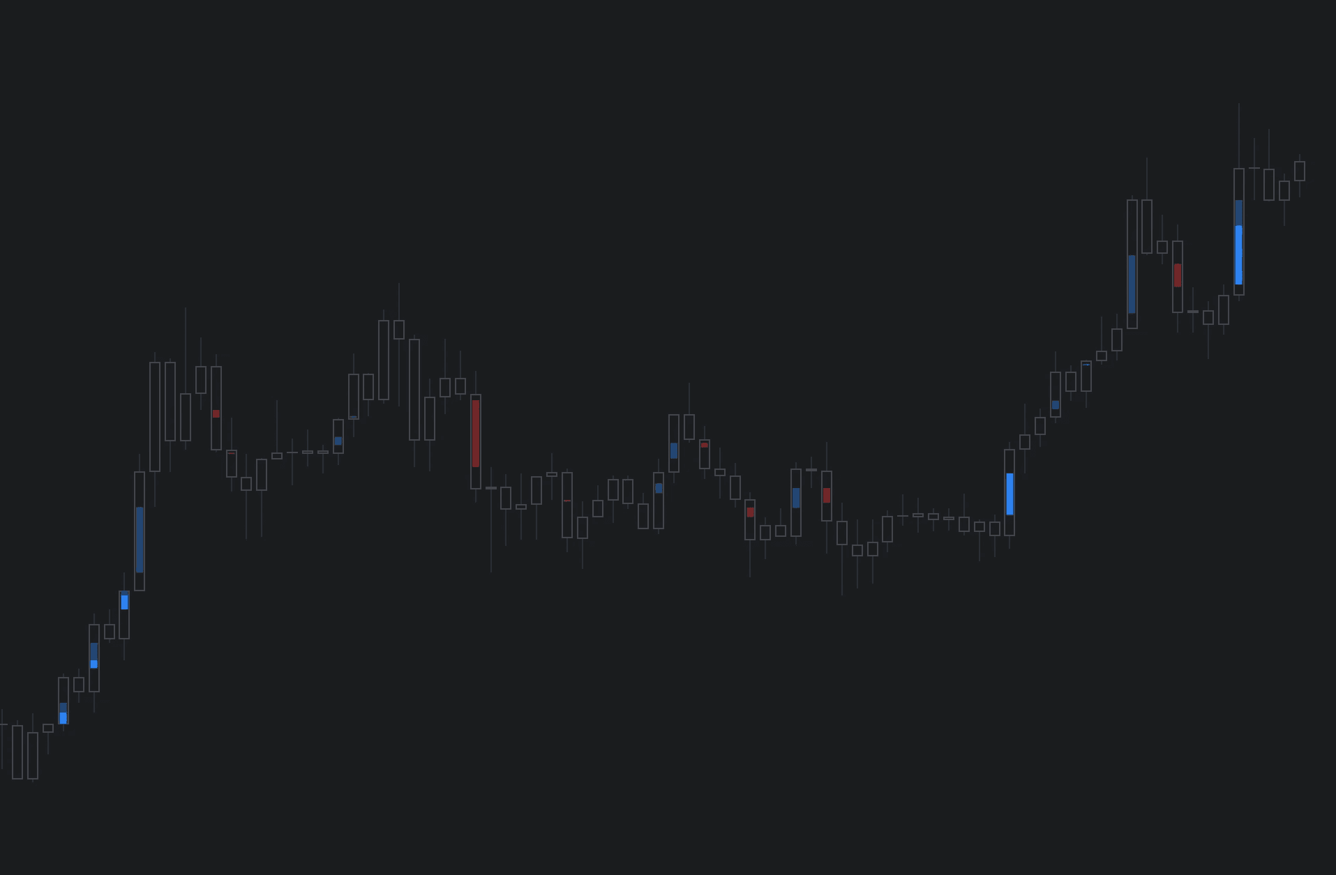
Detecting trapped traders using Volume Footprint
A super simple and highly effective way to detect reversals is spotting trapped traders. This concept is also known as absorption.
Here's the criteria: look for a well established trend, a reversal shaped candle and high volume at the wick.
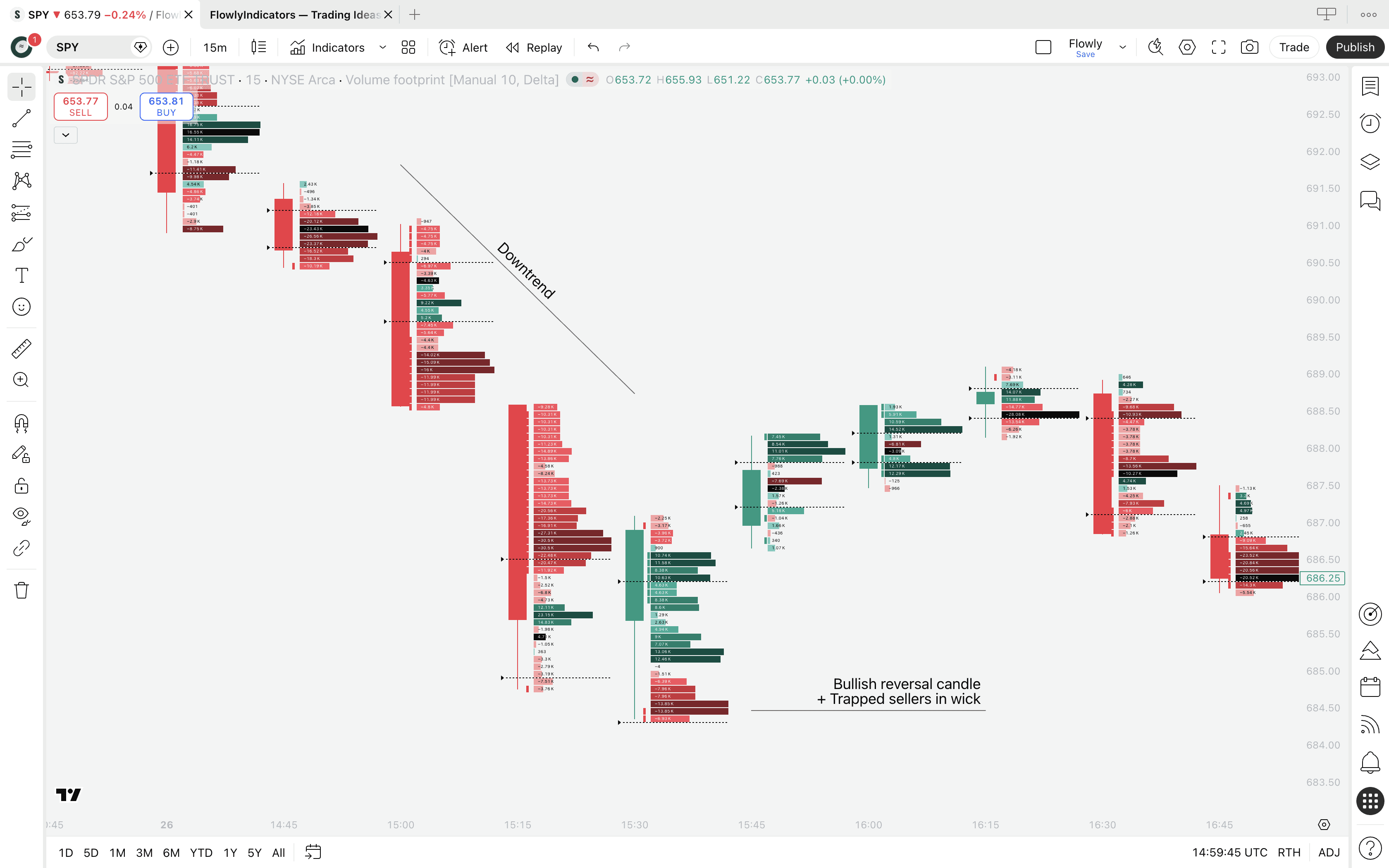
For trapped sellers, look for a well established downtrend with a bullish reversal candle and sell volume at the wick low, as seen on the image.
Trapped buyers work the opposite way - uptrend, bearish reversal candle and buy volume at wick high.
We can also identify trapped traders using Value Area and Point of Control that show where the "mass interest" and "peak interest" are trading at.
If at wick, traders are trapped, in other words "absorbed".
What is absorption in trading?
Trapped traders and absorption essentially speak of the same thing. Here's what happens.
Wick represents the rejected part of the candle - where price went and came back within the candle period. When this area is filled with high volume, participating traders sold or bought into big opposing orders, usually set by more informed traders.
This is a great sign of price finding deep liquidity. Simultaneously, traders executing their trades at the wick get trapped into a losing position.
When price moves further away, trapped traders are forced to cover their position (e.g. buy back their short positions into an uptrend) and reinforce the reversal move even further.
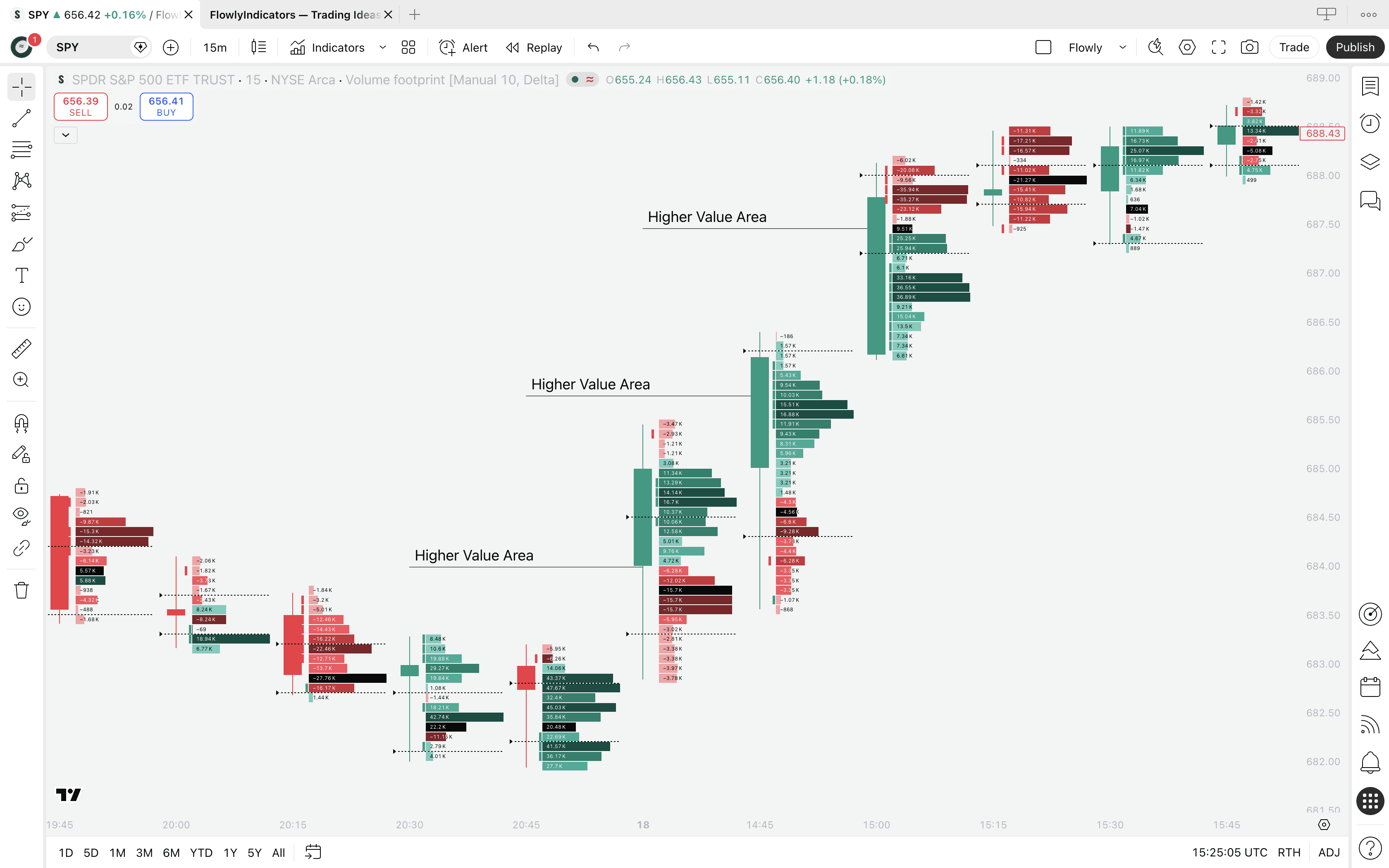
Trend following using Value Area and POC
Value Area and Point of Control show us where the key trading interest is going. We can use this data to better understand what the traders are intending to do - upside, downside, continuation or reversal.
Healthy trends are backed by directionally agreeing Value Area and POC, consistently. This tells us the "mass interest" is flowing towards the trend and pushing through resistance.
For a robust uptrend, look for Value Area and Point of Control that are consecutively higher than the prior ones. For downtrends do the opposite, look for consecutively lower ones.
How to trade Volume Footprint
Volume Footprint can be traded using any method introduced in Auction Market Theory and traditional orderflow trading.
This tool can be used for both reversal and trend continuation signals, as well as for identifying key support and resistance levels.
Here's what we think are the most effective ways to get an edge with footprints.
Detecting trapped traders using Volume Footprint
A super simple and highly effective way to detect reversals is spotting trapped traders. This concept is also known as absorption.
Here's the criteria: look for a well established trend, a reversal shaped candle and high volume at the wick.
For trapped sellers, look for a well established downtrend with a bullish reversal candle and sell volume at the wick low, as seen on the image.
Trapped buyers work the opposite way - uptrend, bearish reversal candle and buy volume at wick high.
We can also identify trapped traders using Value Area and Point of Control that show where the "mass interest" and "peak interest" are trading at.
If at wick, traders are trapped, in other words "absorbed".
What is absorption in trading?
Trapped traders and absorption essentially speak of the same thing. Here's what happens.
Wick represents the rejected part of the candle - where price went and came back within the candle period. When this area is filled with high volume, participating traders sold or bought into big opposing orders, usually set by more informed traders.
This is a great sign of price finding deep liquidity. Simultaneously, traders executing their trades at the wick get trapped into a losing position.
When price moves further away, trapped traders are forced to cover their position (e.g. buy back their short positions into an uptrend) and reinforce the reversal move even further.
Trend following using Value Area and POC
Value Area and Point of Control show us where the key trading interest is going. We can use this data to better understand what the traders are intending to do - upside, downside, continuation or reversal.
Healthy trends are backed by directionally agreeing Value Area and POC, consistently. This tells us the "mass interest" is flowing towards the trend and pushing through resistance.
For a robust uptrend, look for Value Area and Point of Control that are consecutively higher than the prior ones. For downtrends do the opposite, look for consecutively lower ones.
Wrap-up
TradingView's Volume Footprint packs solid orderflow insights into one unified, web based charting ecosystem. No complex configurations, data feeds or latency issues.
With volume/volume delta at price, Point of Control, Value Area and the various templates, you have everything you need to start reading the market at a much deeper level than traditional candlestick charts bend to.
The key takeaways are straightforward: use POC and Value Area to gauge where trader interest is concentrated, use volume delta to understand the balance between buy and sell pressure.
Then apply that context into price action analysis. Result? Higher amount of detail, higher amount of confluence and therefore higher probability setups.
Keep in mind that TradingView's footprint is calculated from lower timeframe data rather than raw exchange feeds, which means total volume at price is reliably accurate, but volume delta should be interpreted as directional pressure rather than true orderflow.
Thanks for reading. Find more below. And stay in the loop by joining our Newsletter.